Case study
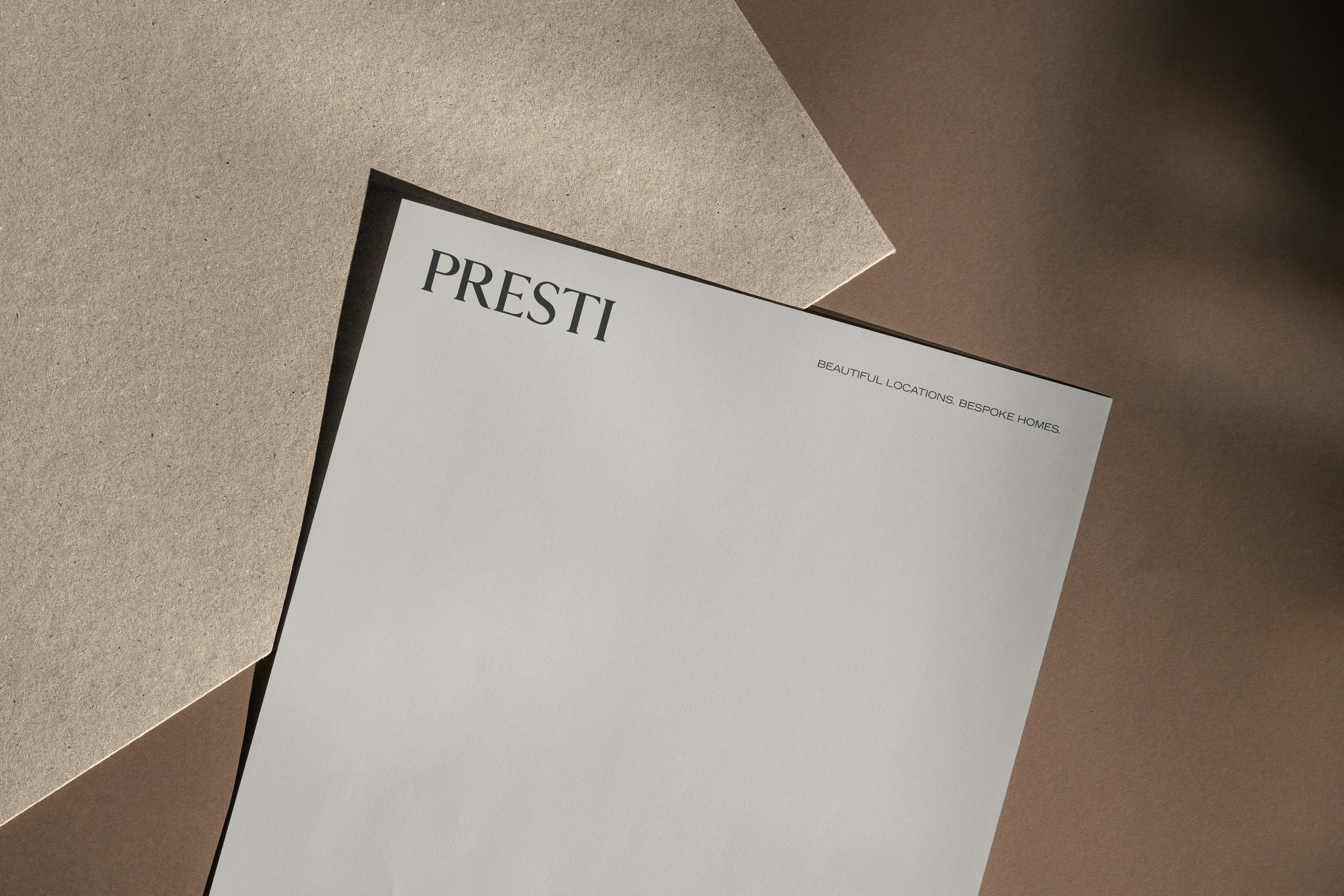
Presti
Twenty years of reputation. Finally, a presence to match.
Presti has been building luxury homes in Montreal's most coveted neighbourhoods for over two decades. Award-winning projects, a clientele that doesn't need convincing, a name that carries weight in the room. What it didn't have was a digital presence that reflected any of that.
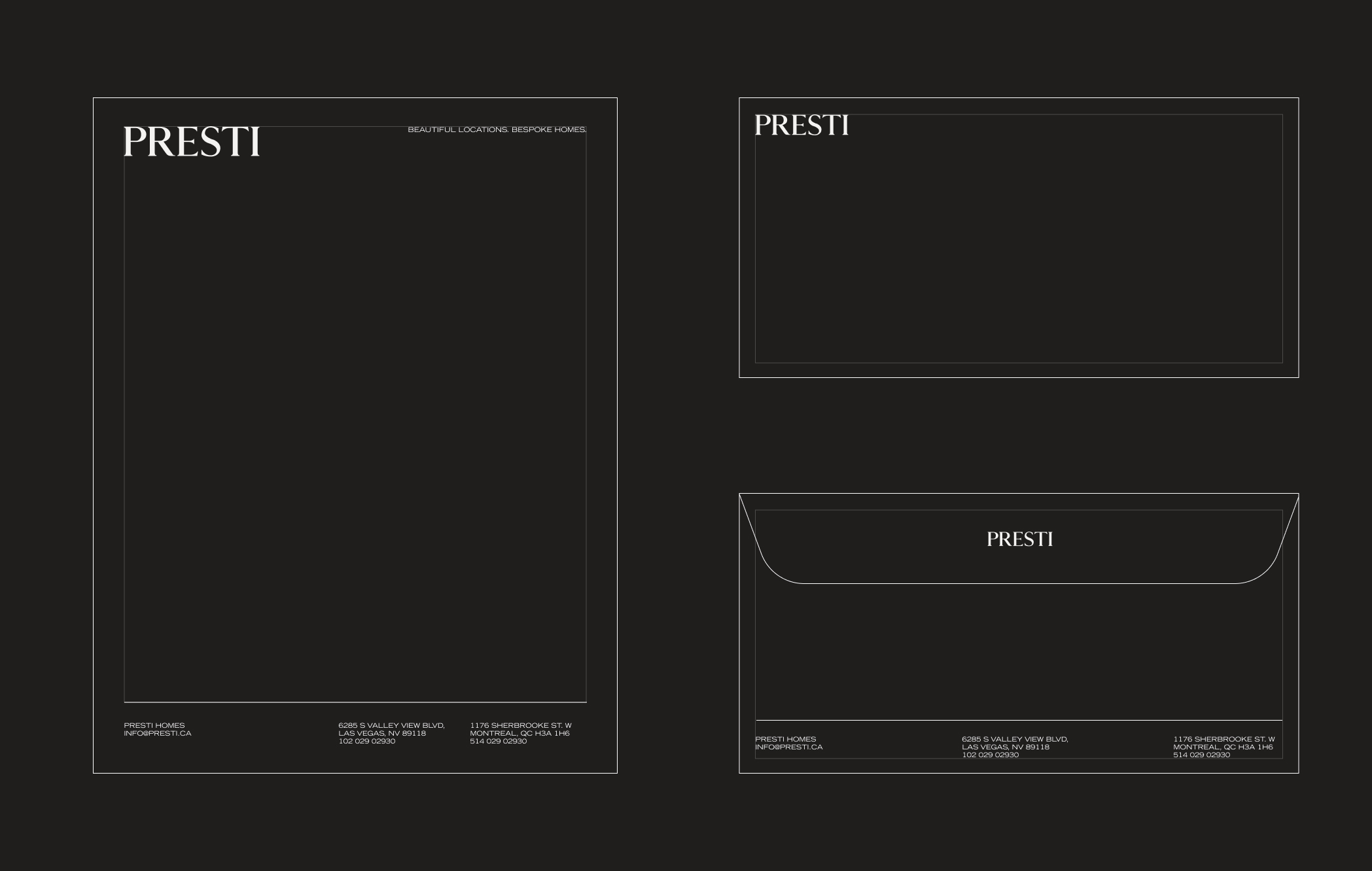
The logo existed. The reputation existed. What was missing was the visual language to carry both. Colour, typography, the quiet details that tell a discerning buyer they're in the right place before they've read a word.
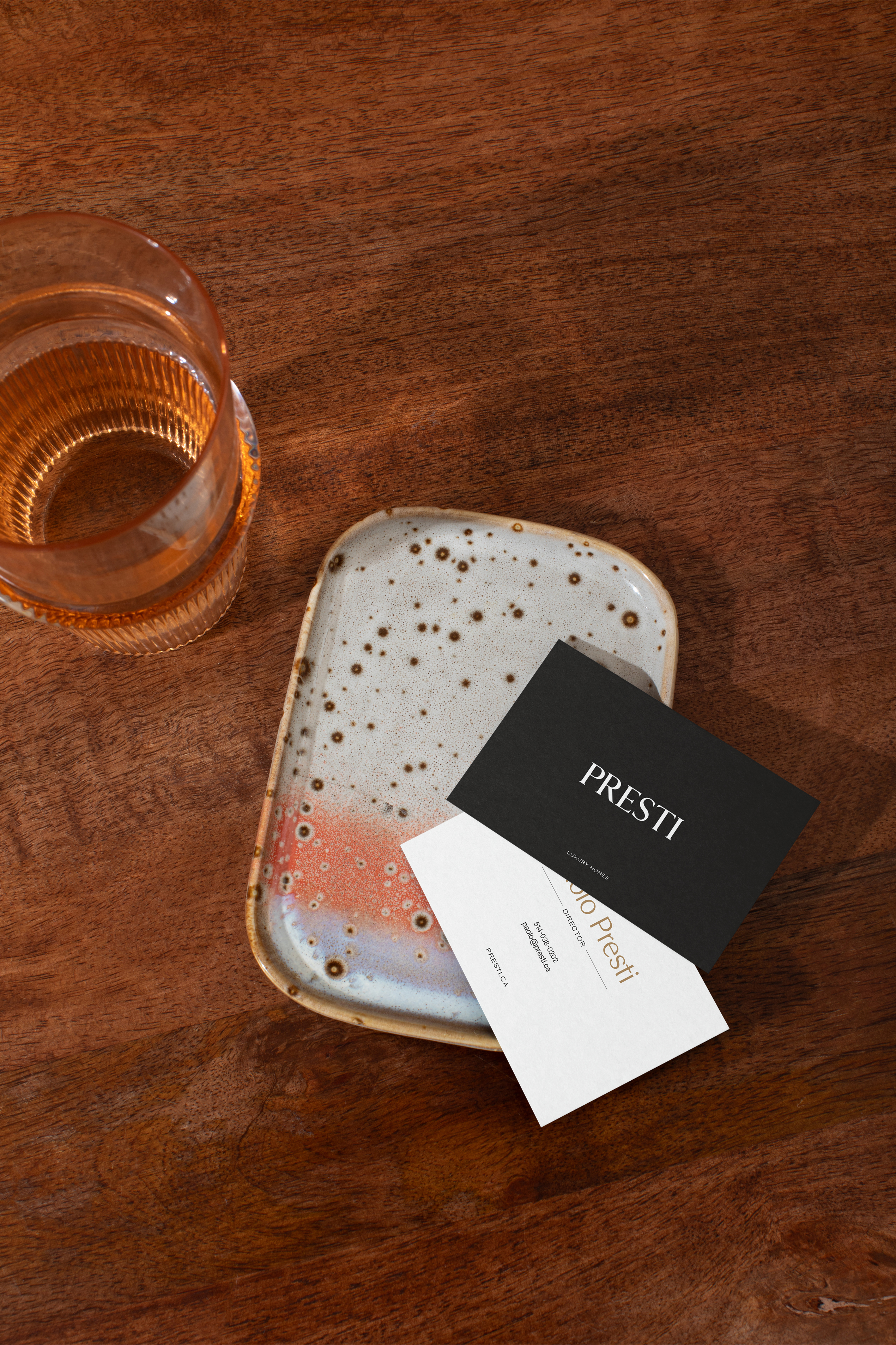
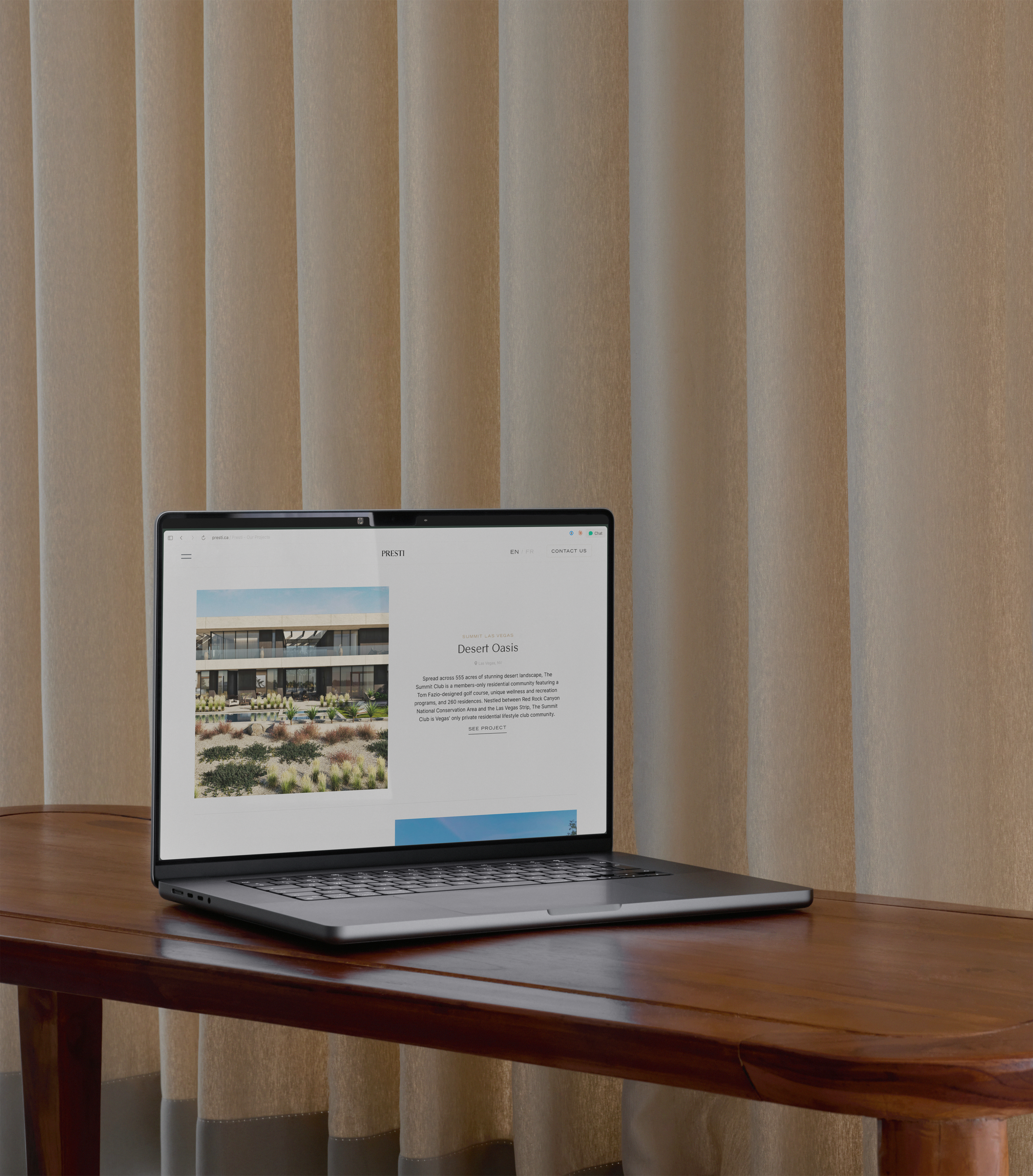
We built that language and then built the site around it. A warm, restrained palette drawn from the materials Presti works with. Stone, concrete, natural light. Typography that feels considered without feeling stiff. Every visual decision made to reflect the level of craft their portfolio already represented. A web experience that moves the way luxury should: unhurried, confident, nothing fighting for attention.
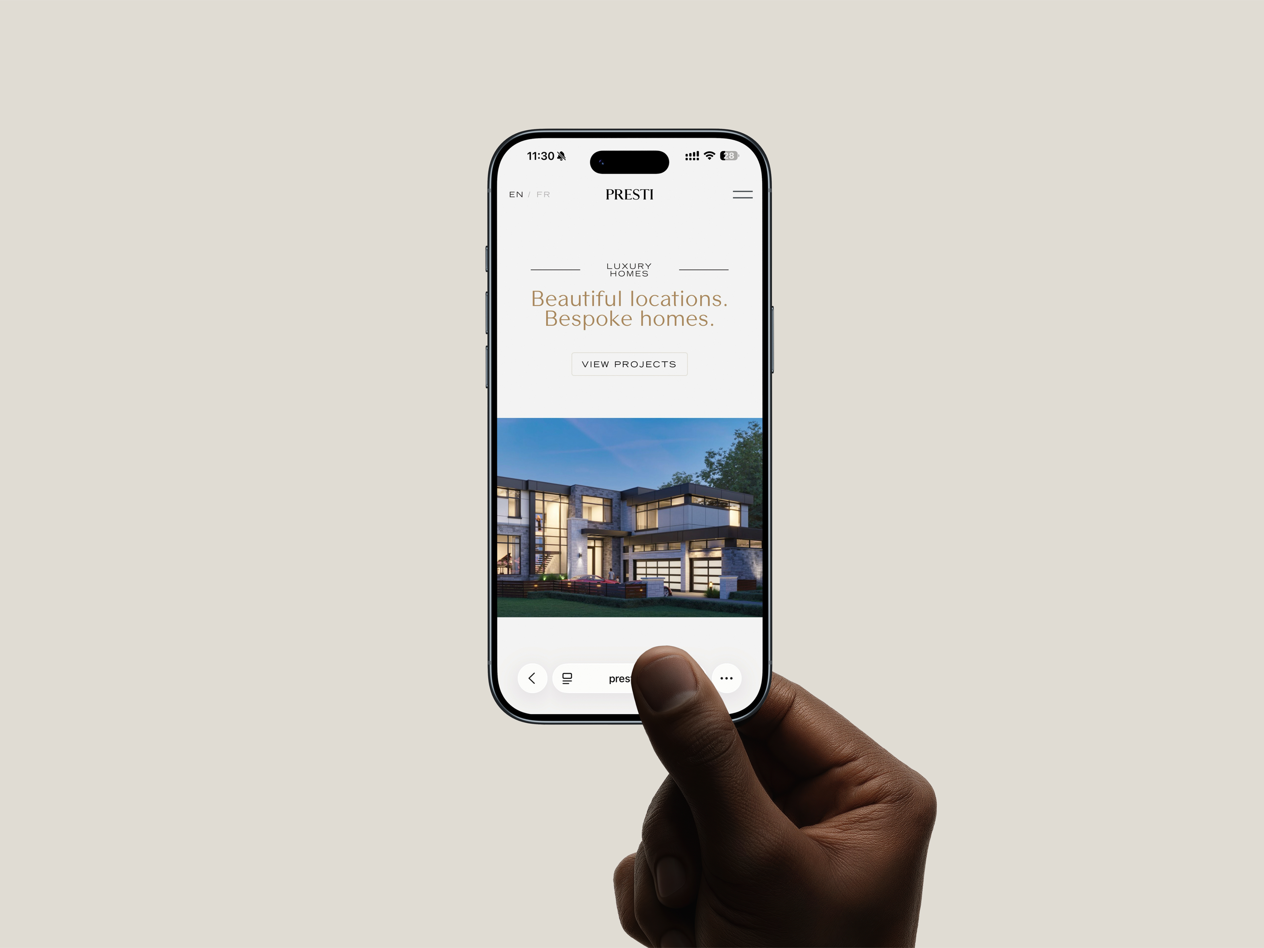
The result is a site that lets the properties speak. And a brand that finally sounds like the company it actually is.