Case study
Ownspace
Buying a home shouldn't require a law degree.
Buying a home in Canada means paperwork, appointments, waiting. Banks, notaries, brokers, each one a separate conversation, a separate process, a separate delay. The industry was designed around itself, not around the people trying to navigate it.
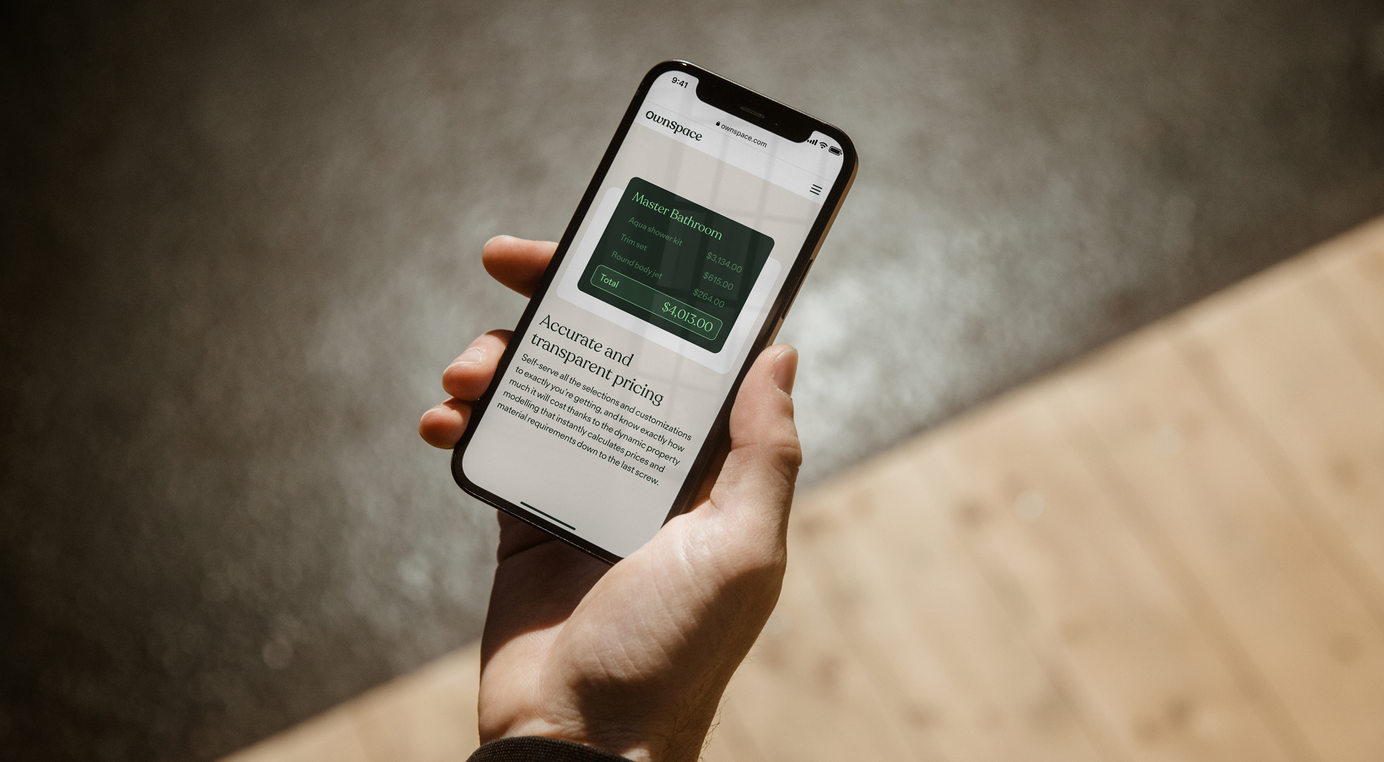
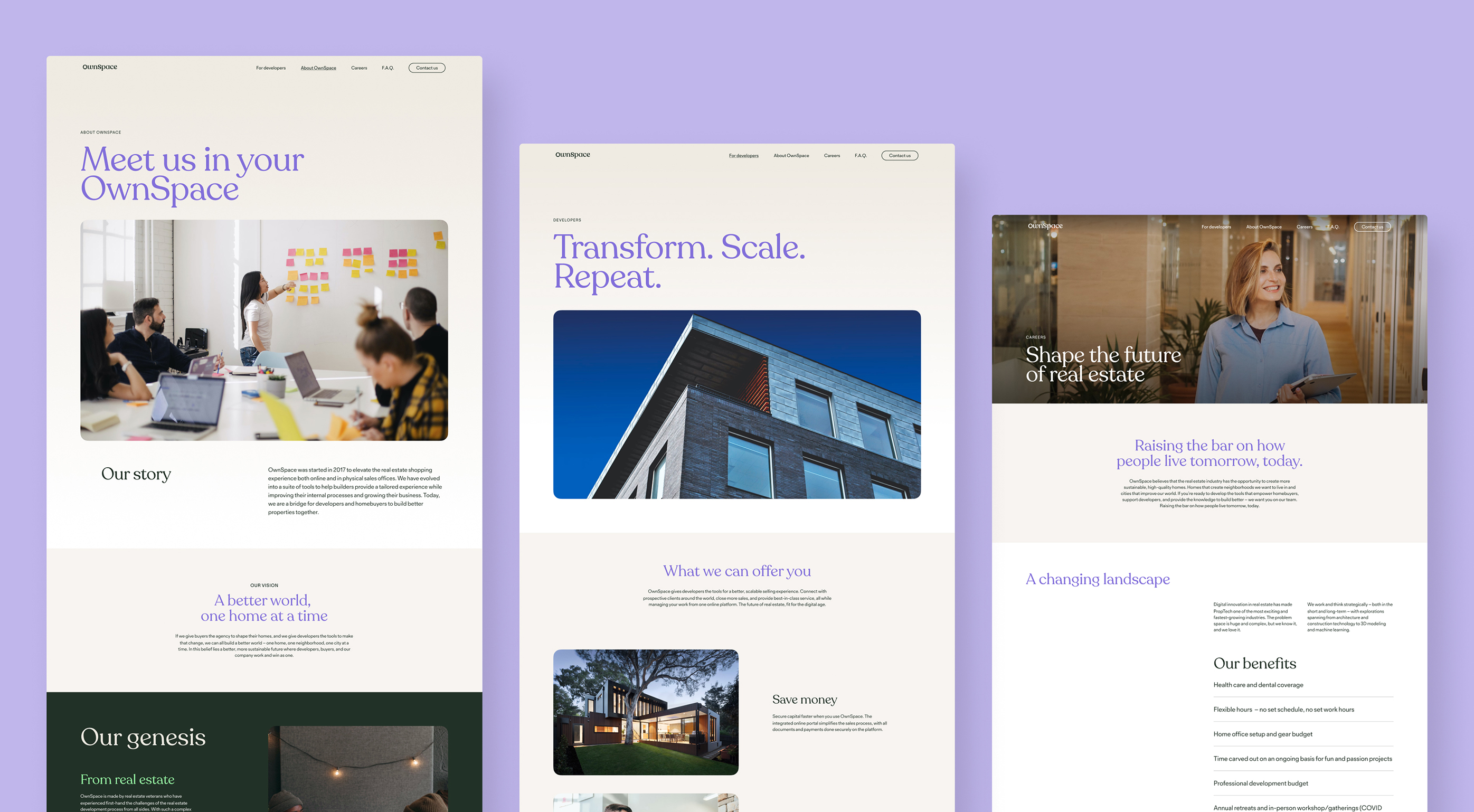
Ownspace was built to change that. A single platform for the entire transaction, start to finish, for both buyers and sellers. List a property, verify identities, negotiate offers, generate contracts, collect signatures. All of it online, all of it in one place.
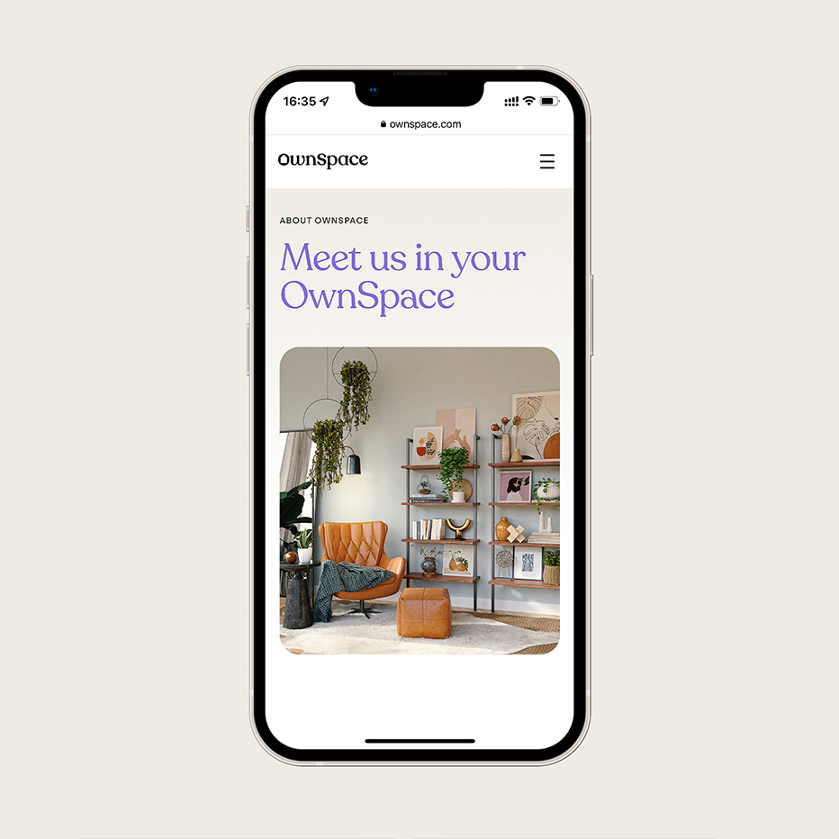
The brief was to make something genuinely disruptive feel trustworthy enough for one of the biggest decisions people make. That tension sits at the heart of the design. Too slick and it feels risky. Too traditional and it defeats the purpose.
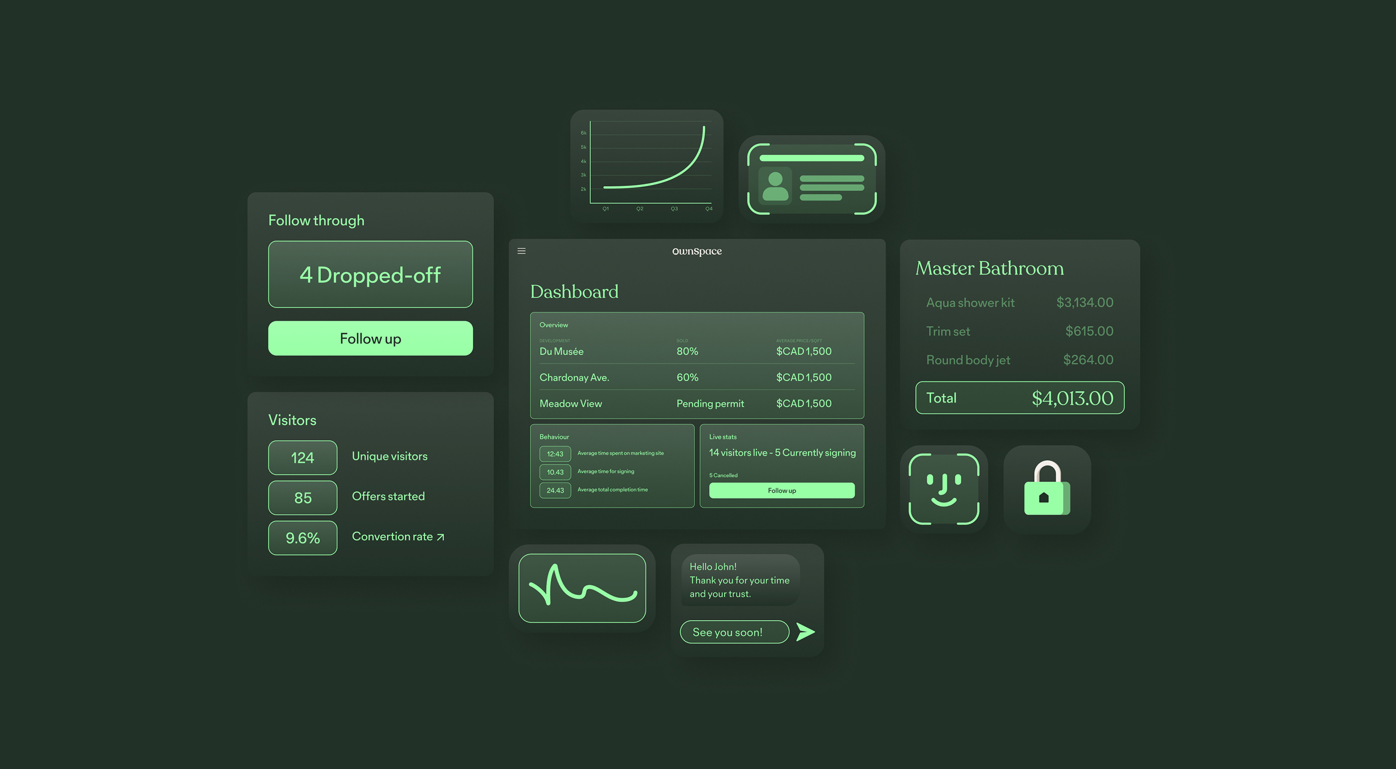
The answer was to move away from the visual language the category expected. No hard edges, no cold tech palette, nothing that felt like it was trying to be a fintech product. Instead, rounded forms, warm and approachable colours, a softness that made the platform feel like something built for people rather than transactions. The kind of interface that doesn't intimidate a first-time buyer.
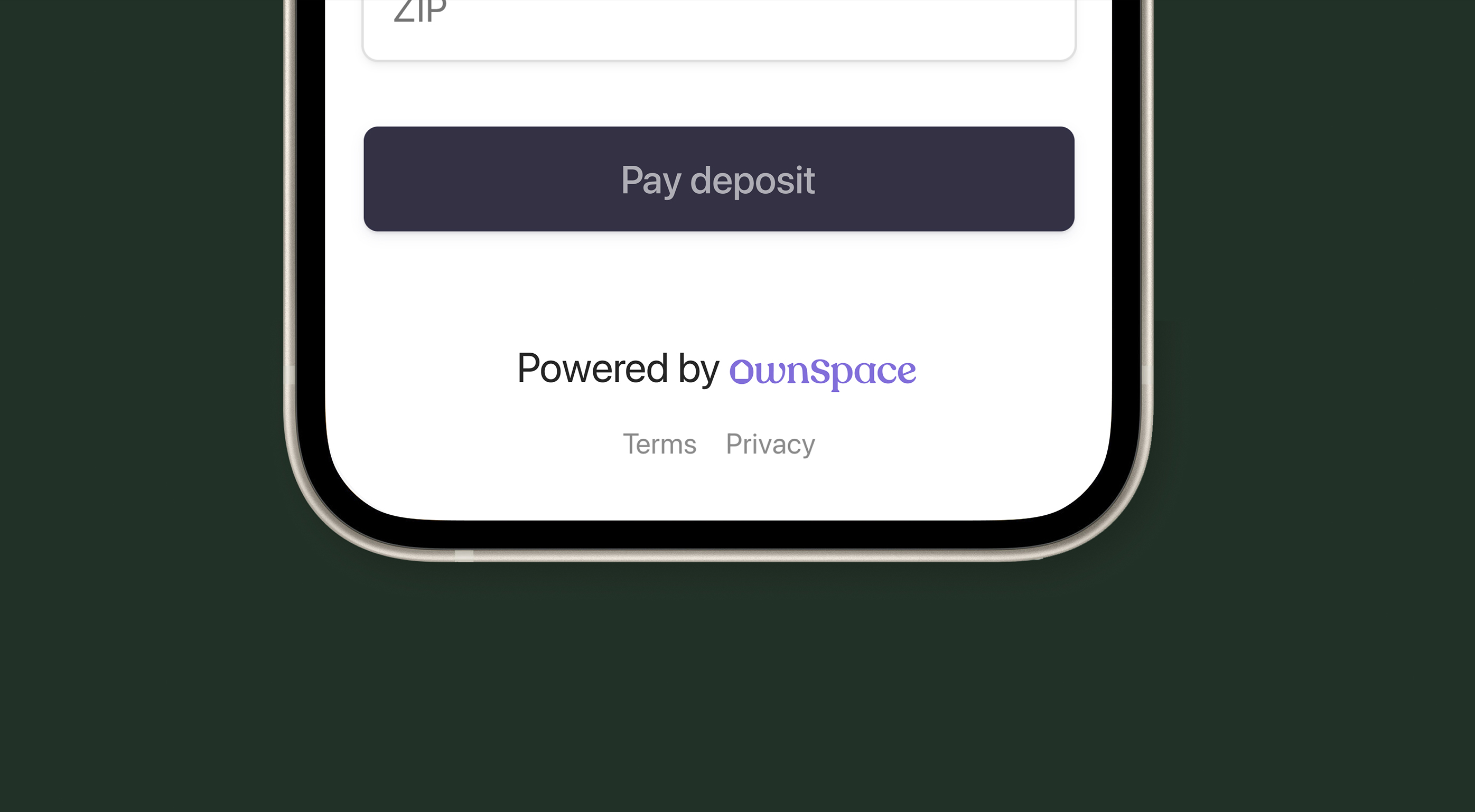
The platform launched and is live today.