Case study
Bank of Montréal
A platform redesigned for business owners. A design system built to last.
Small business owners don't have time for bad software. They're running payroll, chasing invoices, managing cash flow. The last thing they need is a banking platform that makes all of it harder.
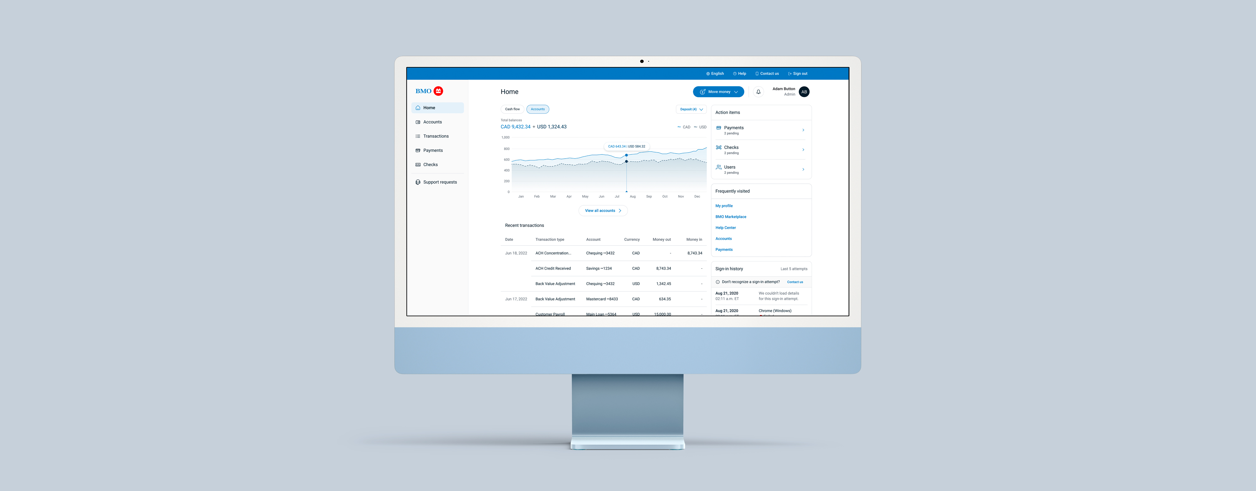
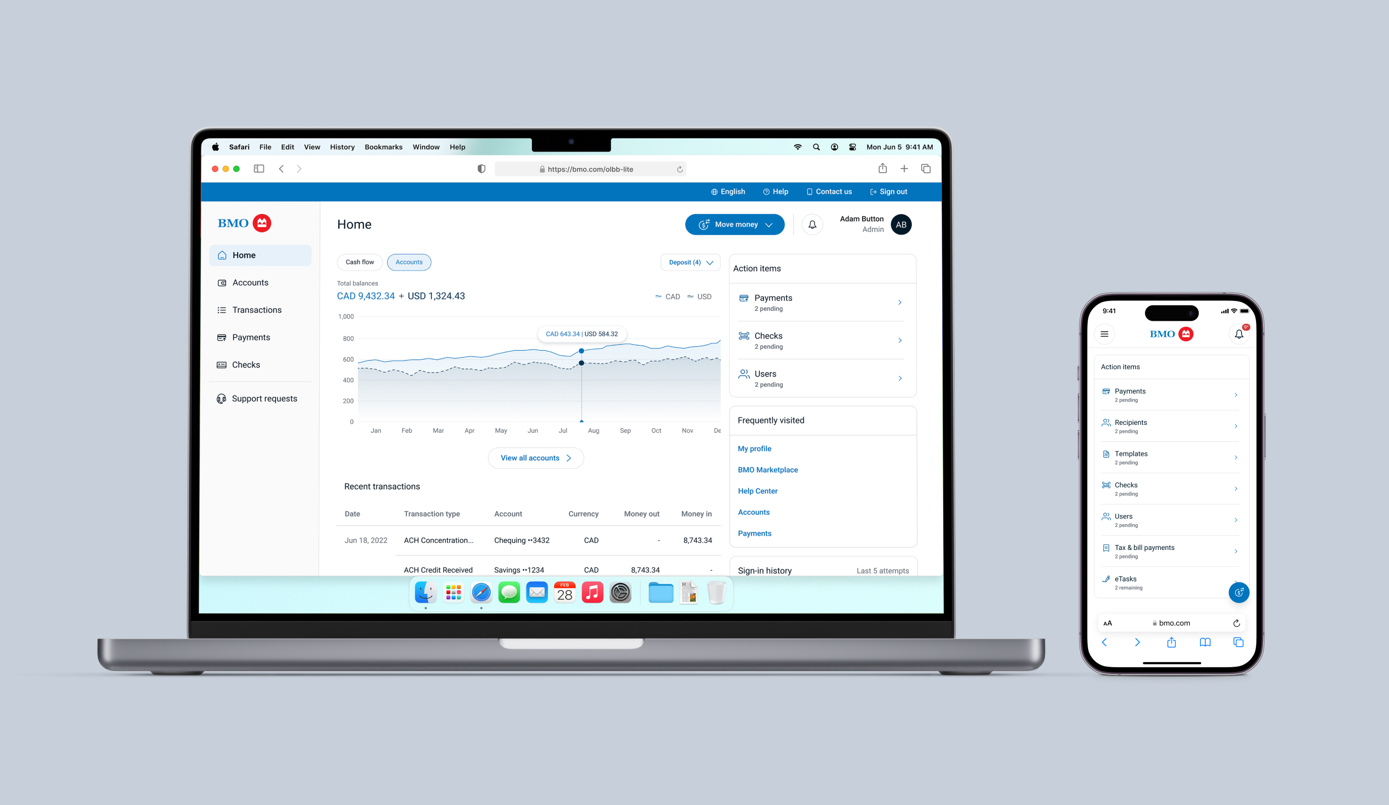
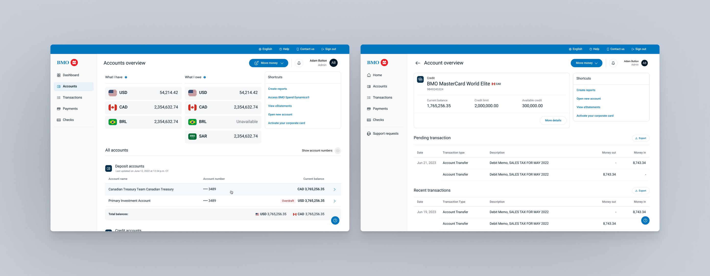
BMO recognized the problem. Their existing Online Business Banking platform had been built incrementally over years, layered with complexity that made sense for large enterprises but was simply wrong for smaller businesses. The navigation was convoluted, the patterns inconsistent, the experience designed for no one in particular. SMB clients were losing hours to a tool that was supposed to save them time. The brief was clear: build something new, built specifically for them.
We started where every good product decision starts: with the people actually using it. Twenty-five hours of interviews with small and medium business owners revealed four things that mattered: time back, independence, cash flow clarity, and a bank that helped them make decisions rather than just process them. Everything else was noise.
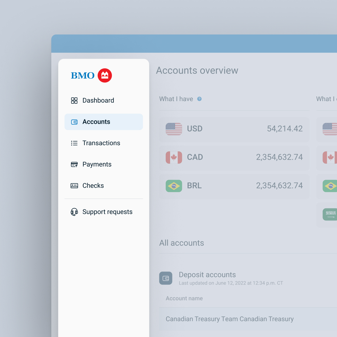
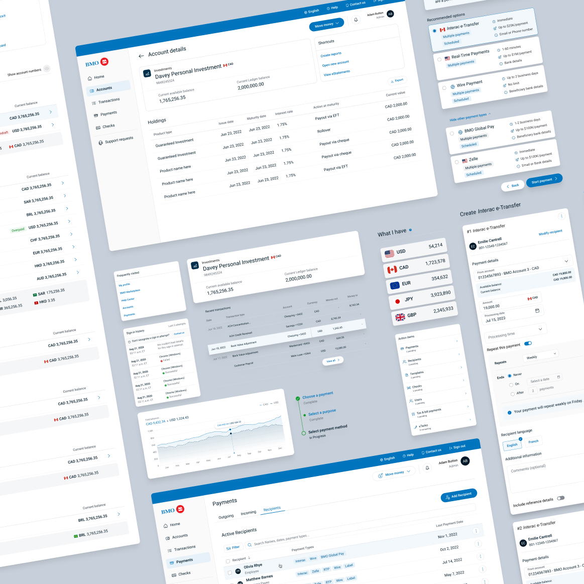
From those four things, we rebuilt the platform from the ground up. Navigation restructured around what people needed to do, not how the bank was organized internally. A side-navigation replaced the sprawling mega-menu. Complex features that added friction without adding value were removed. Educational content was woven in where decisions were actually being made. The interface stepped back and let the business owner move forward.
The platform launched for a select group of clients in Canada in 2024. BMO became the first bank in Canada and the United States to win the Red Dot Award: Design Concept in the Interaction, UI and User Experience category, and the only Canadian or U.S. bank named to Fast Company's World's Most Innovative Companies that same year. Building the platform had also made something clear: to get this right across BMO's entire product ecosystem, the foundation had to come first.
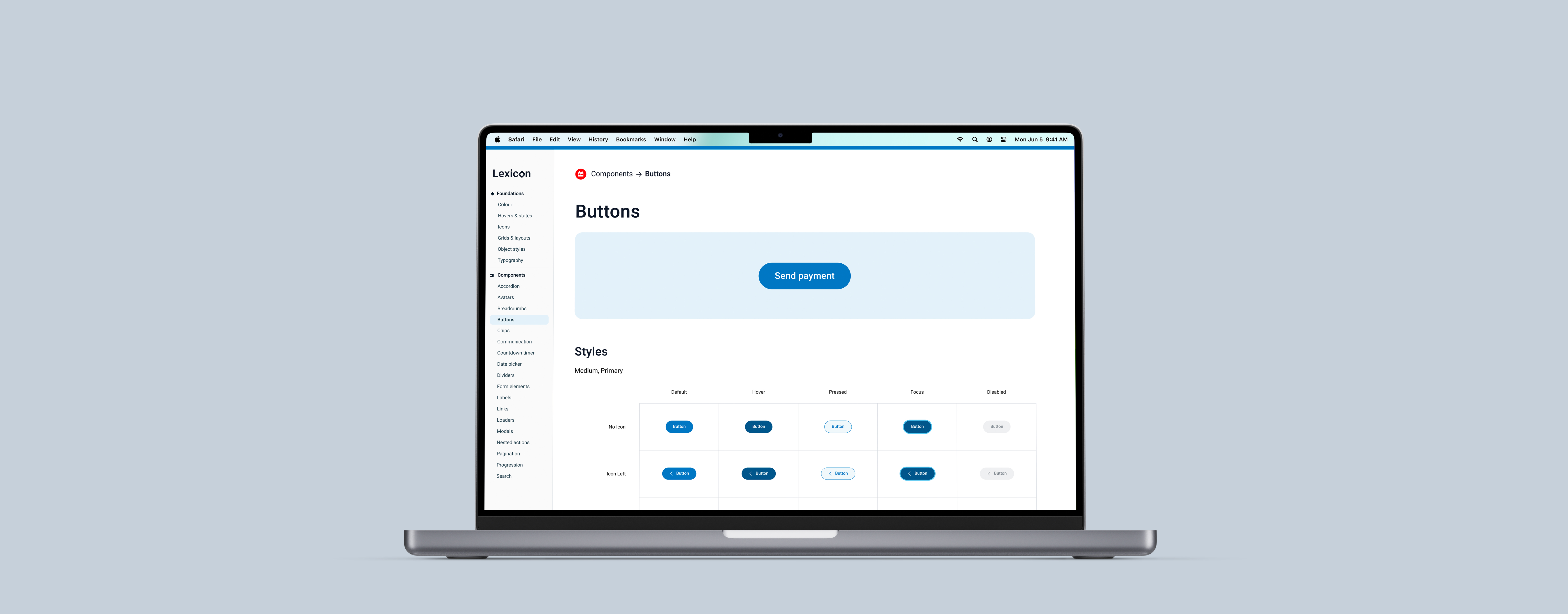
Before you can build a better product, you need to agree on what a button looks like. That sounds small. At BMO, it wasn't. Years of independent teams making independent decisions had produced a product ecosystem with no shared language. Different components, conflicting guidelines, duplicated work, inconsistent experiences. Not because anyone was careless, but because nobody had ever stopped to build the foundation first.
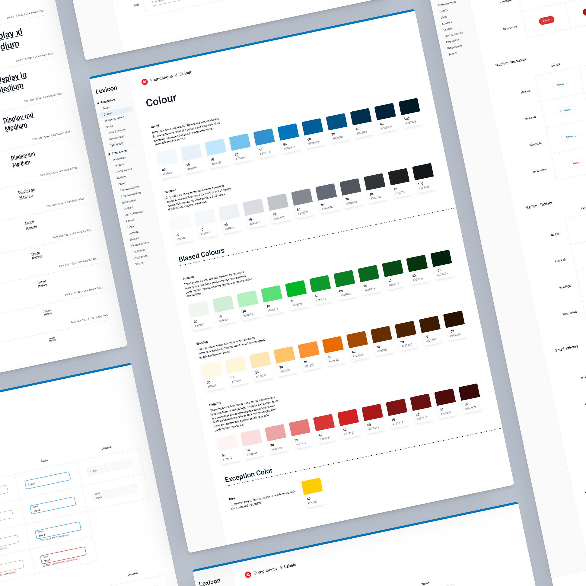
We built Lexicon to fix that. Starting from first principles: grid, spacing, typography, color, iconography. Each decision made once, documented clearly, and built to hold. From there, a component library: every interaction considered, every state accounted for, built in parallel with the Online Business Banking platform it was designed to serve. And from there, patterns: reusable solutions to recurring problems, flexible enough to accommodate the brand's future without breaking its present.
When the system was stable enough to run on its own, the work shifted to keeping it alive. Intake processes, design reviews, production pipelines. A design system without governance is just a Figma file with good intentions.
Results
83%
Subscriber satisfaction
Of subscribers satisfied with the new design tools introduced across the platform.
100%
Product impact
Reported a positive impact on product performance after adoption.
53%
Productivity increase
Faster design-to-development cycles across product teams.