Case study
Flying Tables
A brand that travels as far as the food does.
Most dining experiences ask you to sit down and stay put. Flying Tables asks where you want to go.

The concept is simple and completely its own: a pop-up that moves. Each edition lands somewhere new, Thailand, Sichuan, Chiang Mai, led by chef Jiulong Yu, who cooks the dishes you'd rarely find outside the places that made them. No shortcuts, no compromises, no fusion for the sake of it. Just a passport to somewhere authentic.
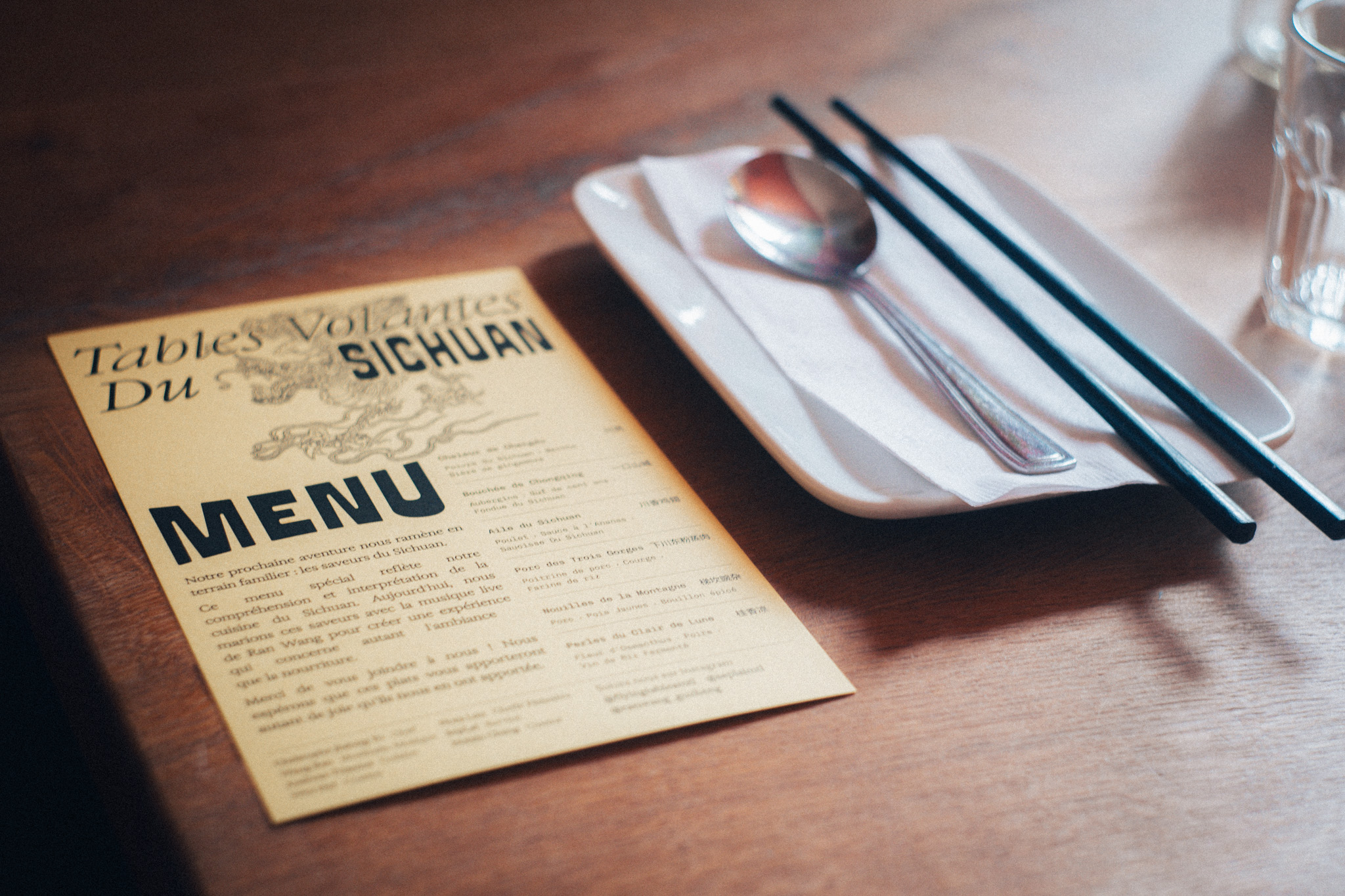
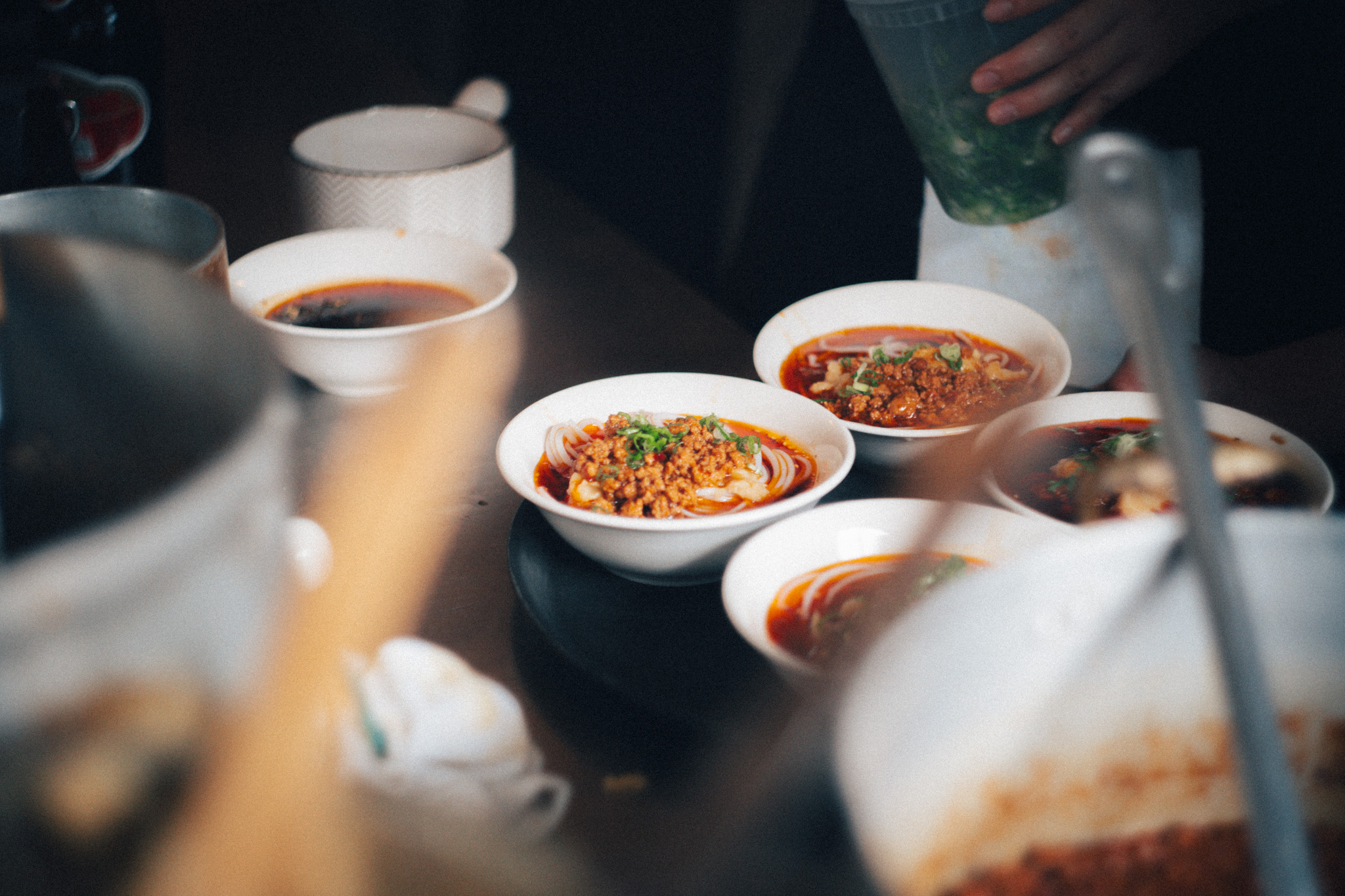
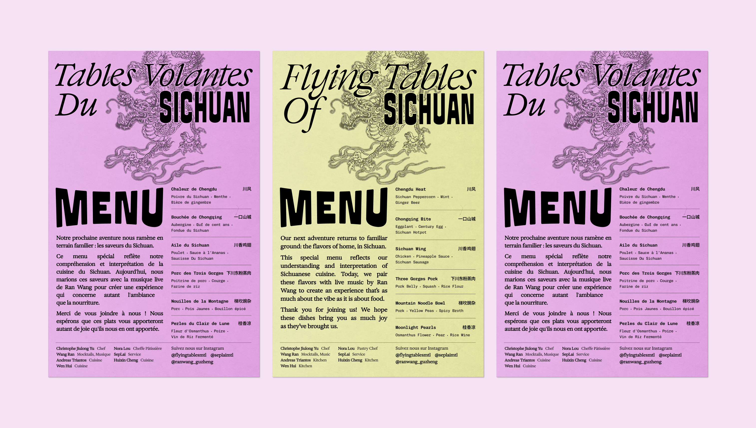
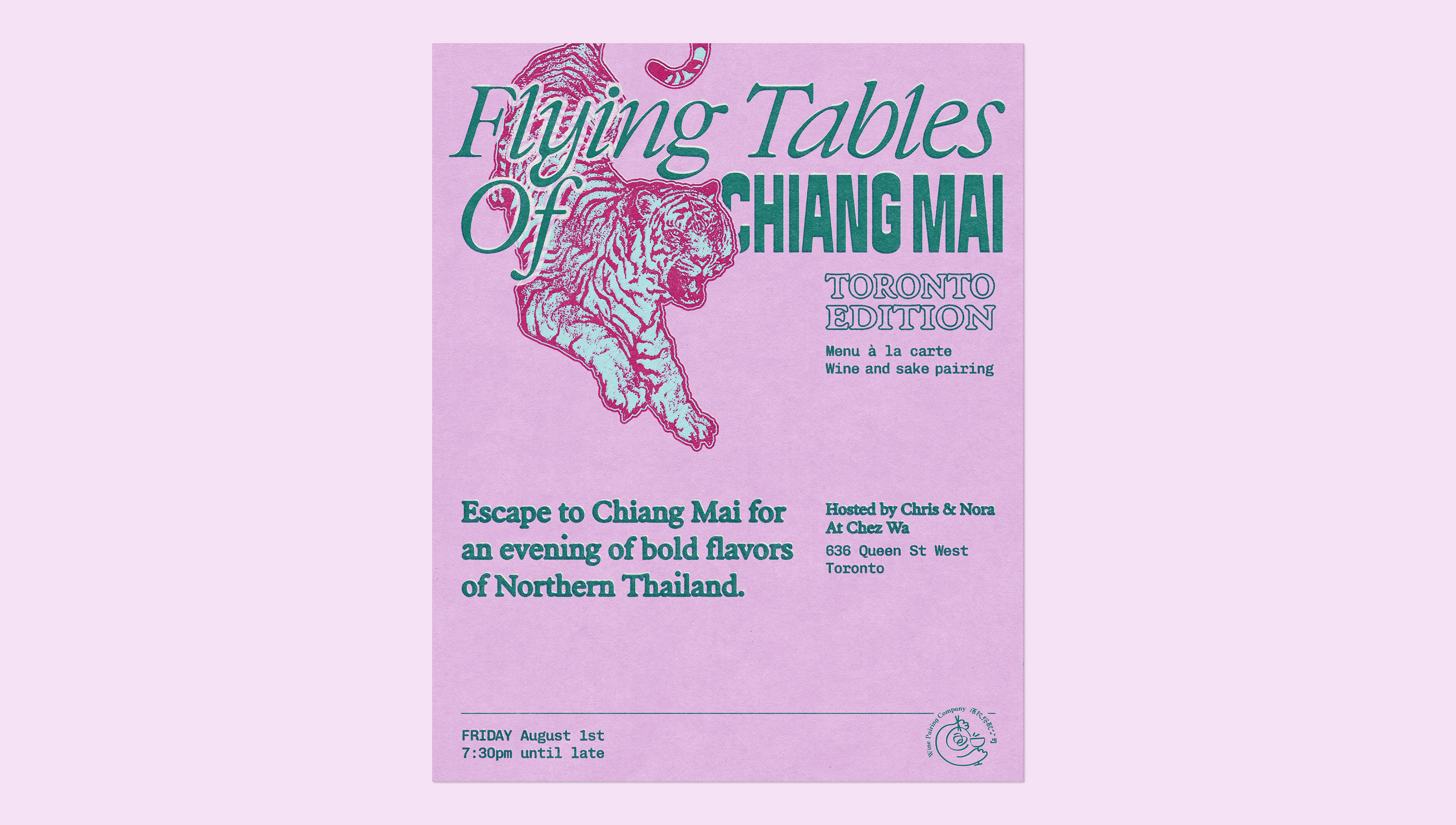
The brand is anchored in a custom serif wordmark, a quiet nod to vintage travel cartography, made contemporary. From there it shifts with every destination. Thailand got sun-bleached blues and dusty pinks, a risograph texture that felt like a poster found in a market. Sichuan came in electric violet and acid yellow, red dragons bleeding across the page. Chiang Mai brought tigers leaping across pink and mint. The palette changes, the illustration changes, the energy changes, the DNA never does.
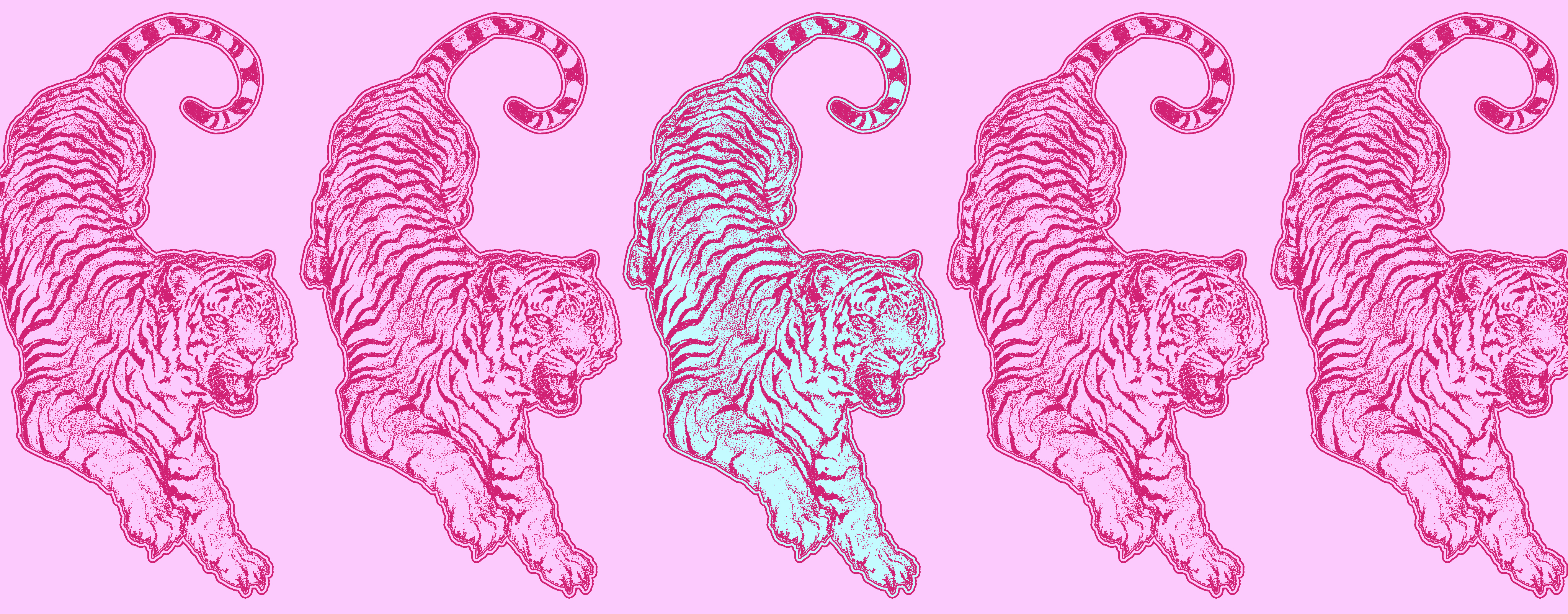
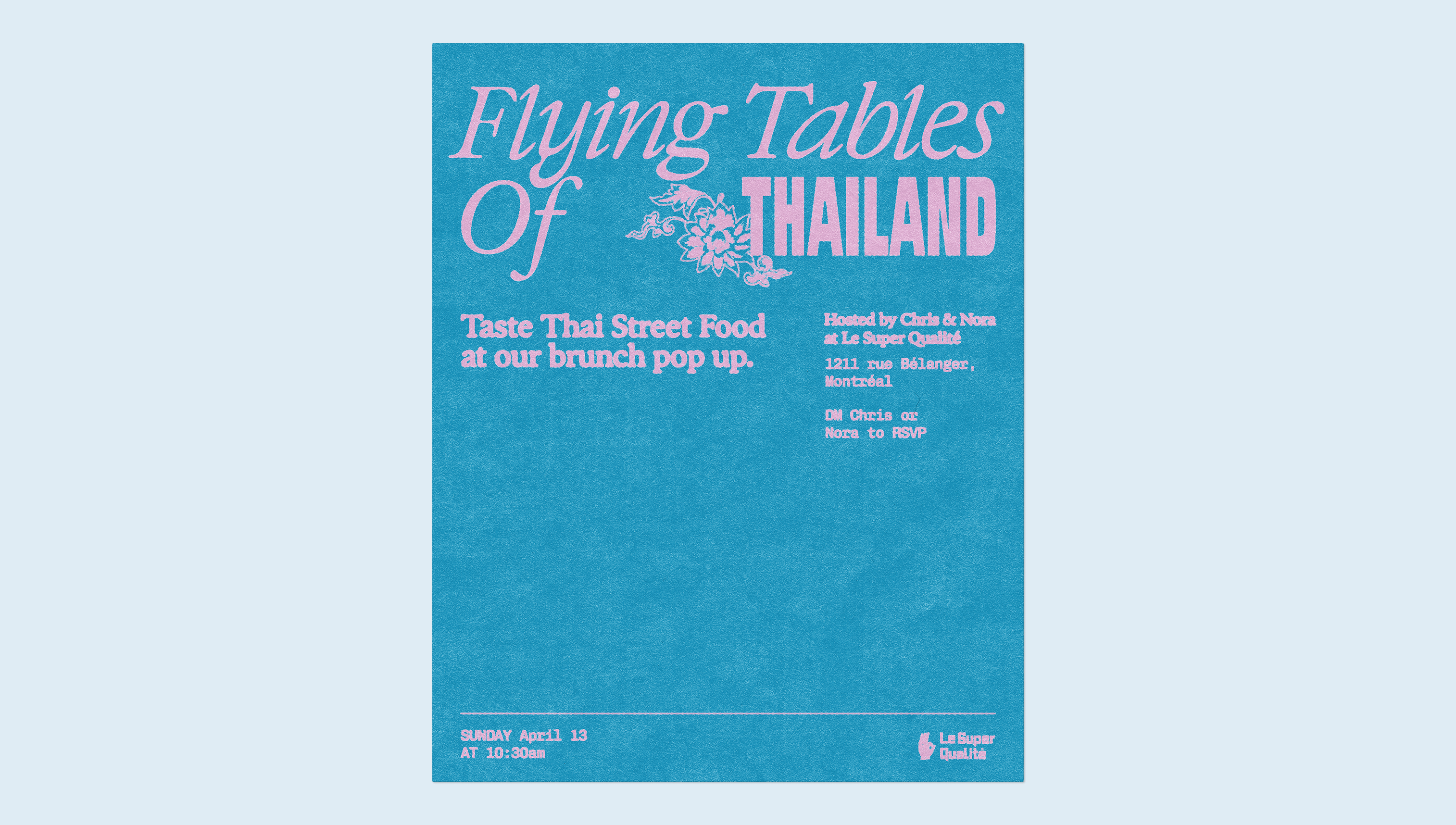
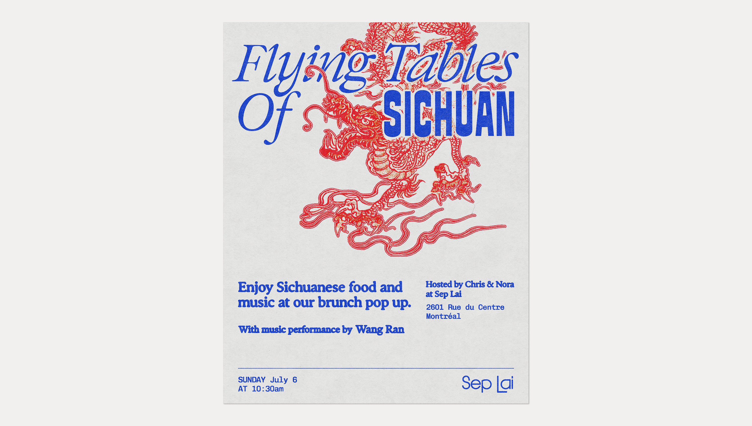
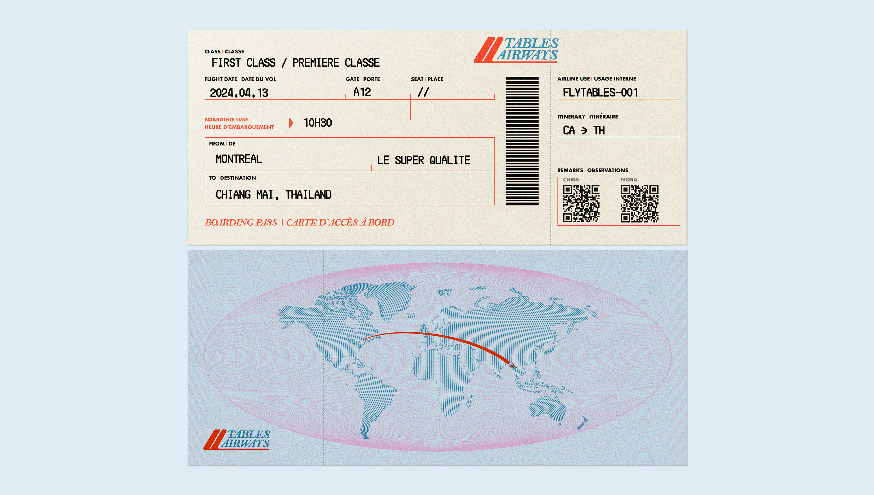
Every edition gets its own complete visual world: posters, menus, boarding passes, social content. Flying Tables is still flying.
Results
6/6
Editions sold out
Every edition since launch has sold out completely.
1k+
Instagram followers
Built an audience of over 1,000 followers in under a year.
4
Press features
Featured by The Main, MTL à Table, Tastet and Silo 57.